THE STORY BEHIND OUR TOHU
More than a logo.
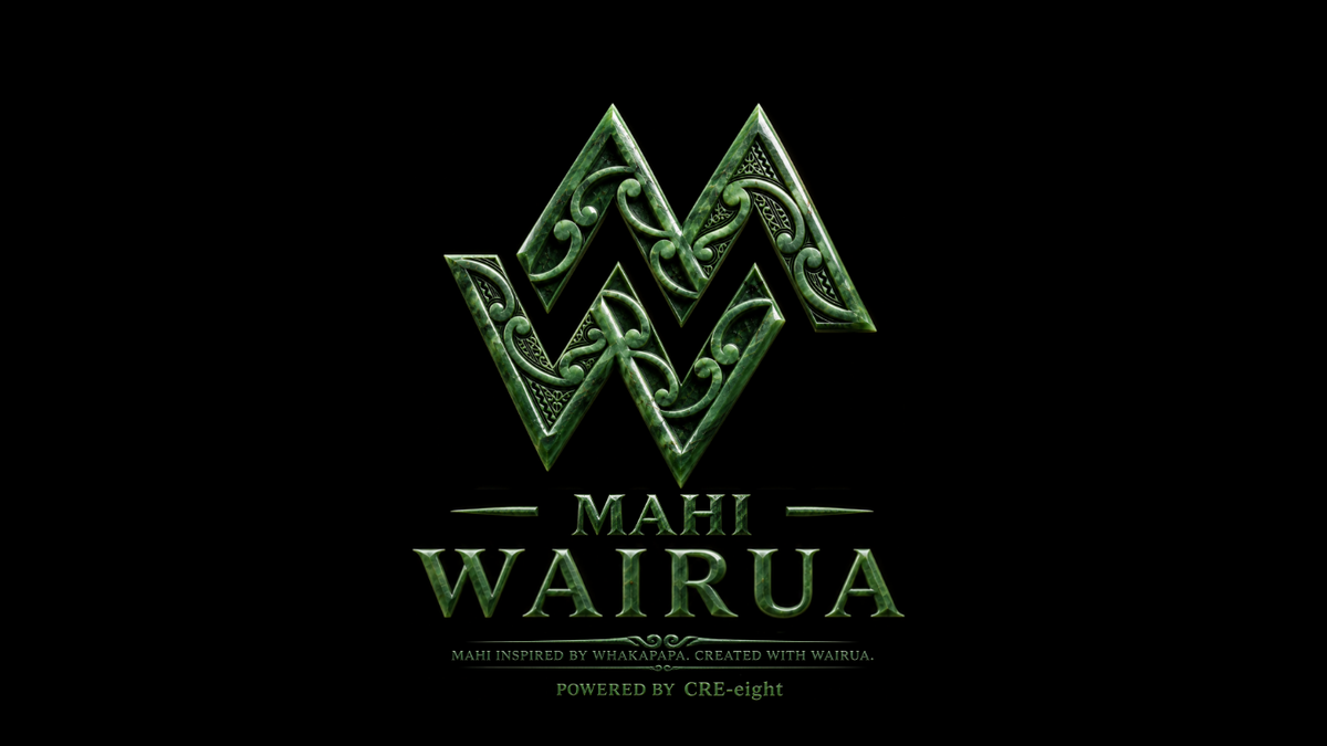
When we began developing Mahi Wairua, we knew the tohu needed to represent more than the letters of our name.
We wanted something that carried our whānau story.
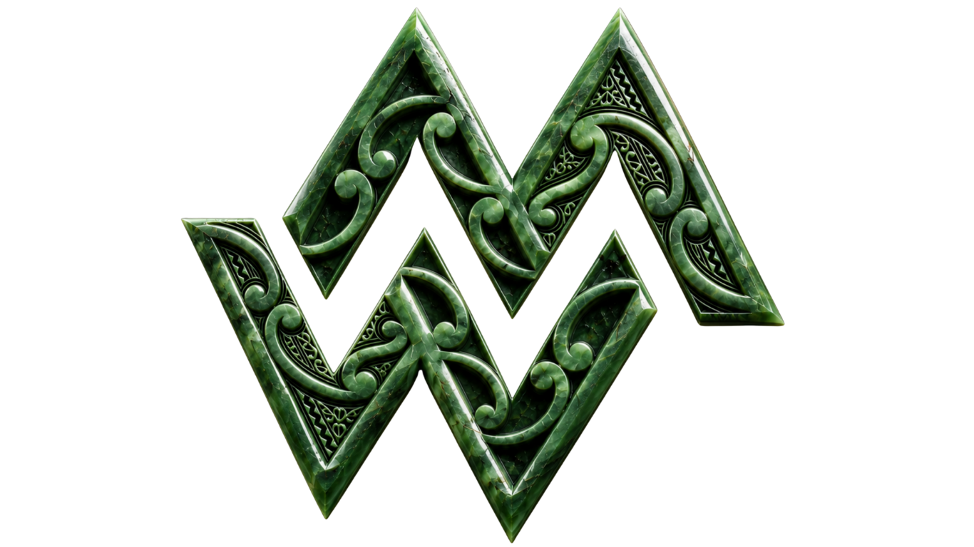
At first glance, the tohu is formed around two letters:
M — Mahi.
W — Wairua.
The two forms come together as one, representing the relationship between what we physically create and the meaning we put behind it.
For us, one doesn't exist without the other.
But there is another story within its shape.
Our maunga
The peaks of the tohu were developed to represent three maunga carried within our whānau story.
Two acknowledge the whakapapa carried by Jovan, while the other acknowledges the whakapapa carried by Kirstan.
Rather than standing separately, they come together within a single tohu.
For us, that represents something bigger.
Two people.
Different whakapapa.
Different journeys.
One whānau.
The maunga also remind us of tūrangawaewae — of having places and whakapapa through which we know where we stand and where we come from.
Three whakapapa
Our whānau has connections through Ngāti Porou, Ngāti Hikairo and Ngāti Kahungunu.
Those connections are important to the story behind Mahi Wairua.
They aren't there simply to give our brand an identity.
They are part of our identity.
Our tohu therefore isn't intended to be a generic representation of Māoritanga. It is a personal tohu developed around our own whānau, our whakapapa and the kaupapa we want Mahi Wairua to carry.
The patterns within
Within the M and W are flowing forms inspired by Māori pattern and the koru.
For us, they represent whakapapa, growth, whānau and continuation.
A koru unfurls outward while remaining connected to where it began.
That idea resonates strongly with what we're trying to build.
Mahi Wairua is about moving forward creatively without forgetting what sits behind us.
The different patterns flowing through the letters can also represent the different whānau lines that come together through our children and the generations that will follow them.
Why pounamu?
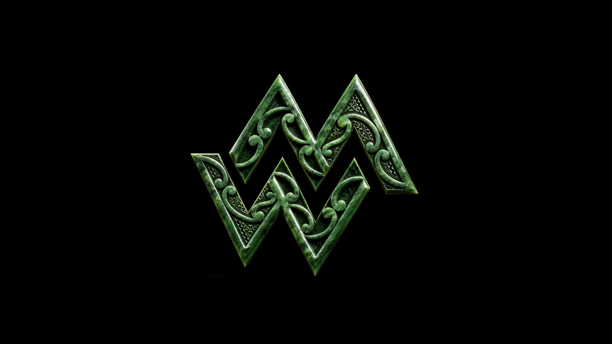
We chose to present our tohu with the appearance of pounamu because we wanted it to feel enduring and precious rather than temporary.
Something with weight.
Something that feels connected to Aotearoa.
Something that could represent both the past and what we hope to carry into the future.
The pounamu treatment has also become an important part of the visual identity of Mahi Wairua — particularly against the black that surrounds it.
A tohu for our whānau
Ultimately, the Mahi Wairua tohu isn't supposed to tell everybody's story.
It tells ours.
It represents our whakapapa.
Our maunga.
Our whānau.
Our creative journey.
And the relationship between mahi and wairua.
As Mahi Wairua grows, we hope the tohu grows with it.
One day, our tamariki and mokopuna may look at it and know the story of why it was created.
And that, to us, would give it more value than any logo ever could.
Mahi Wairua